Alrighty folks, so this is my FIRST tutorial EVER, so bear with me. For Christmas I made these for my Mother in Law and after posting them on Facebook on The Wood Connection's wall, I had a question about how I did it.
I told the person who asked the question I'd try to get a tutorial going and so this is that.
I told the person who asked the question I'd try to get a tutorial going and so this is that.
This is what we are aiming for:
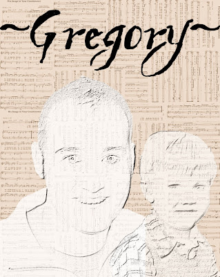
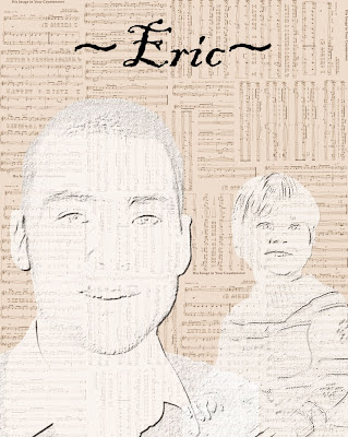
I'll admit that my first go around turned out differently than this one will. But I think I like the second version better and it's more of what I was originally going for!
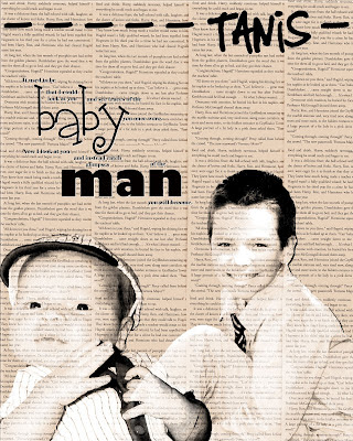
So here goes the tutorial.
I am working with Paint Shop Photo Pro X3, but I'm sure most graphic programs can accomplish the same thing, you'll just need to be familiar with your particular program.
I am working with Paint Shop Photo Pro X3, but I'm sure most graphic programs can accomplish the same thing, you'll just need to be familiar with your particular program.
AGED TEXT WITH PICTURES
#1. Find the book, newspaper, song, etc. you'd like to work with.
(I'm sure there are scrapbook papers out there somewhere that fit this purpose, but both times I've done this I've worked with sheet music and books I owned. For this case I'm using a Harry Potter book as my son loves this series. I wanted to use a different book, but I couldn't find it. The book I wanted actually has his name in it...)
(I'm sure there are scrapbook papers out there somewhere that fit this purpose, but both times I've done this I've worked with sheet music and books I owned. For this case I'm using a Harry Potter book as my son loves this series. I wanted to use a different book, but I couldn't find it. The book I wanted actually has his name in it...)
#2. Scan whatever text you've chosen into your computer.
(If you are using a digital paper, you won't need to do this.)
(If you are using a digital paper, you won't need to do this.)
(I really thought mine scanned in crooked, but then after rotating, I think I messed it up worse... You will have to play with the settings to get the right angle.)
4. Crop if necessary
(I found that after rotating my image, it gave me more white space than I needed. I then cut off the excess.)
5. Age your text
This is done by clicking EFFECT - PHOTO EFFECTS - SEPIA TONING.
You will then adjust the sepia toning to whichever color best suits your mood.
You will then adjust the sepia toning to whichever color best suits your mood.
6. Open a new document
7. Decide if you'll need to resize your sepia text.
The original size of my text was a little too big to enter multiple times on the new document like I wanted. So I had to resize until I was happy with the fit.
The original size of my text was a little too big to enter multiple times on the new document like I wanted. So I had to resize until I was happy with the fit.
8. Copy the sepia text
9. Paste the sepia text onto your New Document
You can paste your text in whichever direction and placement suits you. I did the first one in odd ways and the one I did for this tutorial I just kept straight up and down.
10. After you're are done pasting, you can close your original text document.
It'll save some computer space and memory!
11. Once you finish pasting, SAVE this new completed document!!!
12. Choose your 1st picture.
13. See what size your picture is.
In the toolbar click IMAGE, followed by RESIZE, take note of the size of your picture, then hit CANCEL. DO NOT click SAVE. You don't want to mess up your picture.
14. Open a new document
Give this image the size of your picture that you wrote down in #13.
15. Copy your picture.
16. Paste your picture onto the NEW DOCUMENT as a NEW LAYER
17. Delete extra area that you don't want to use for your picture.
This is seriously the step that takes the longest. You can start out by using the MAGIC WAND and changing the TOLERANCE.
18. Towards the end you'll probably have to use the ERASER tool to get the areas right by what you want to keep.
You don't have to get this perfect. You do want it to be fairly smooth, but because we will be changing the coloring to black and white, you don't have to get every little pixel that you don't want gone.
19. When you have it all done, it should look similar to this:
Only you should have a transparent background. When I saved it for this tut, I accidentally saved a jpg instead of a gif or png. Therefore, I lost my transparency.
20. Crop picture down if needed.
You can see in the above example how much white space I had. I had to crop my picture down so I only had what I needed.
21. You'll now want to MERGE LAYERS together.
22. Now you'll got back to EFFECTS - PHOTO EFFECTS - BLACK & WHITE FILM
23. Resize image if needed
You'll want to see how this is going to look on your finished product, if it's too big make it the size you want. It'll take some playing around to get it just right.
24. Copy picture
25. Paste AS A NEW LAYER onto your full text image
26. Make sure you click on your picture layer NOT the text layer and...
27. Change OPACITY
This is another step where you can suit it to your liking28. You can leave your picture looking like that and go to step 32 OR...
29. Double click on your picture layer
30. In the window that comes up change the BLEND MODE to HARD LIGHT
31. At this point you may need to READJUST the OPACITY
32. Add a drop shadow.
Effects - 3D Effects - Drop Shadow33. Follow Steps 12 - 32 with a different picture
34. When you have both pictures on your page, make sure you click on each picture layer separately and do the following:
ADJUST - BRIGHTNESS/CONTRASTChange the contrast to your liking
35. Add text and or word art to your liking.
Adjust placement of text, word art and pictures if needed.
36. Save as a .jpg and print off to be framed or put onto the photo blocks found at The Wood Connection!
This was my completed picture. I wasn't quite sure which one I liked best, so I saved all three...What do you guys think?
SUPPLY LIST:
Pictures were snapshots taken by me
WORD ART - Bethany Harty
TEXT - Miserably Lose
TEXT - Miserably Lose



No comments:
Post a Comment